Design Patterns
May 30, 2021
Terms every graphic designer should understand and apply when working with prototypes, applications, sketches, and more. In this post I have summarized the most useful and provocative terms that will indeed help improve performance, memorization, knowledge, and work environment.
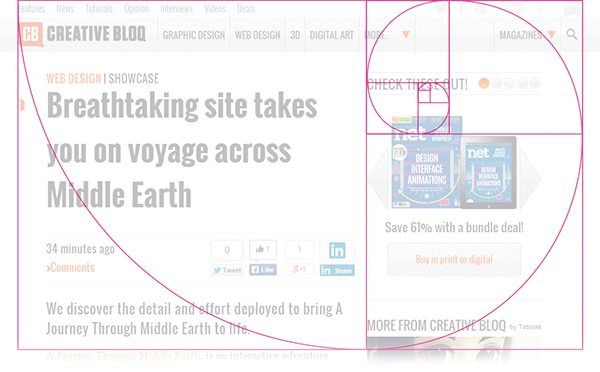
Golden Ratio
The Golden Ratio, or Golden Section, is a mathematical ratio. It is commonly found in nature, and when it is applied to designs, it fosters organic and natural-looking compositions that are aesthetically pleasing by the eye. The mathematical formula boils down to the division of two parts. The first part is the longer part and the second part is the smaller part. This equals the sum of both parts divided by the longer part, which in turn is the representation of Phi(Φ). When applied to design, the Golden Ratio provides a sense of artistry; an X-factor; a certain je ne sais quoi. The most famous golden ratio is the golden rectangle, that can be split into a perfect square and a rectangle the same aspect ratio as the original rectangle.
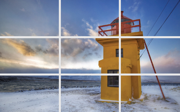
Rule of Thirds
The rule of thirds helps artists and photographers create a well balanced and interesting shot. When taking a shot, start by breaking the image down into thirds, a total of 9 parts. With this in mind, the rule of thirds now identifies the four important parts of an image that is considered the point of interest in the frame. The rule of thirds also gives you four 'lines' that are useful positions for elements in your photo. Studies have shown that when viewing images, people's eyes usually go to one of the intersection points most naturally rather than the center of the shot.
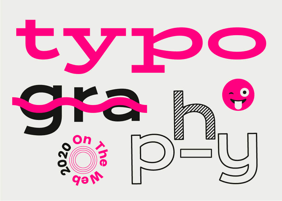
Typography
Typography is maybe one of the most important parts of design, as it is a representation of making written language legible, readable and appealing when displayed. It deals with the essence of arranging letters and text in a way that makes each copy legible, clear, and visually appealing to the reader. Typography is a vital component of the user interface design. Good typography will establish a strong visual hierarchy, provide a graphic balance to the website, and set the product's overall tone. Typography builds brand recognition and influences decision making.
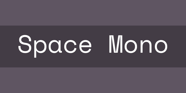
Monospace
Monospace is a non-proportional font whose letters and characters each occupy the same amount of horizontal space.
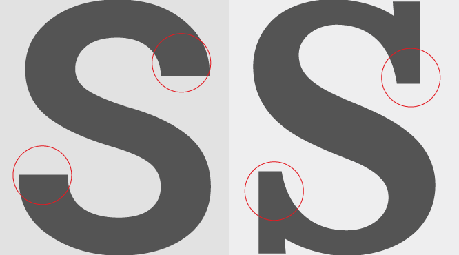
Serif & Sans-serif
A serif is the little extra stroke or curve at the end of each letter, whereas sans-serif font does not include any extra stroke at the end of the letters. "Sans" literally means "without".
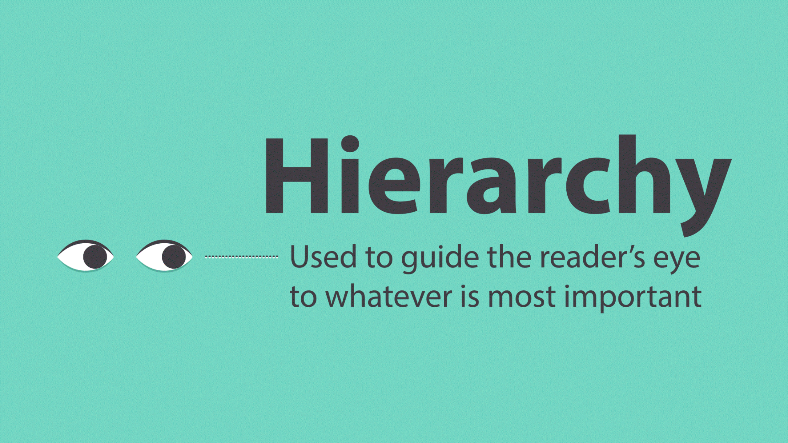
Hierarchy
Typographic hierarchy is an essential part of any design or layout. It is a system for organizing type that establishes an order of importance within the data, allowing the reader to easily find what they are looking for and navigate the content.
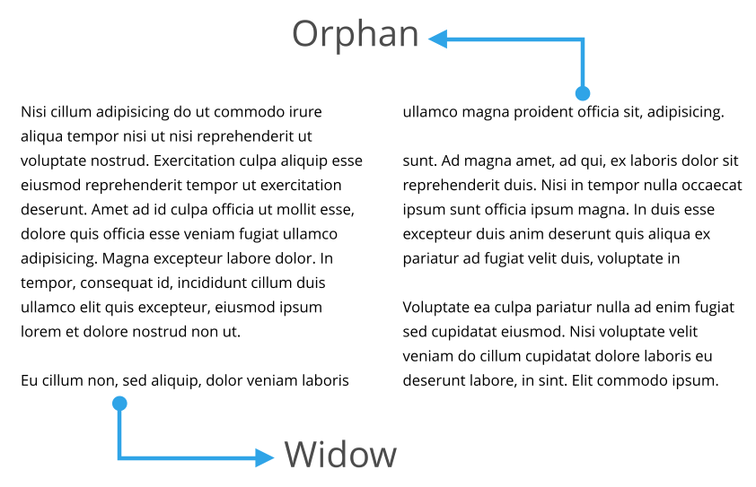
Orphans & Widows
Widows and Orphans are lines of text that appear at the beginning or end of a paragraph, which are left alone at the top or bottom of a line. Orphan is a single word that appears at the end of a paragraph or the beginning of a column or page, separated from the rest of the text. Widow is a paragraph-ending line that falls in the beginning of the following page or column, thus separated from the rest of the text.
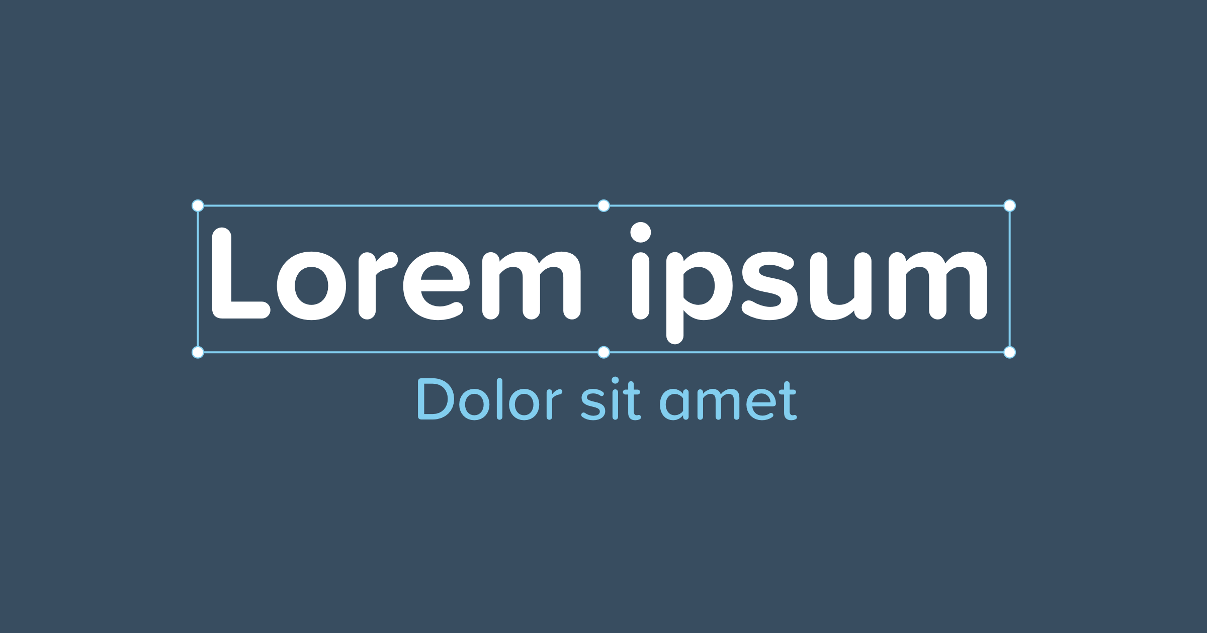
Lorem Ipsum
Lorem Ipsum is a placeholder text that is commonly used to demonstrate the visual form of a document or a typeface without relying on meaningful content.
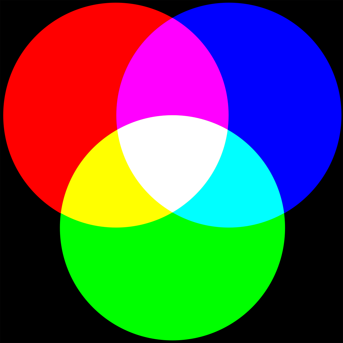
RGB
RGB color is a model in which red, green, and blue light are added together in various ways to reproduce a broad array of colors. RGB tends to be used for on-screen purposes. RGB is the additive color mixing model.
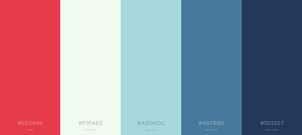
Palette
A color palette consists of colors that can be utilized for any illustration or design work that represents your brand. The chosen colors should be designed to work harmoniously with each other.
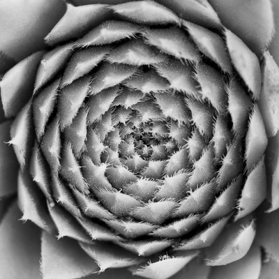
Monochrome
Monochrome is used to describe designs or photographs in one color or different shades of a single color.
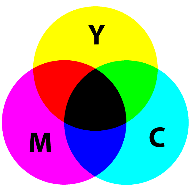
CMYK
CMYK is a color model that is used for print purposes. CMYK colors begin as white and then get darker as more colors are combined. CMYK is the subtractive color mixing model.
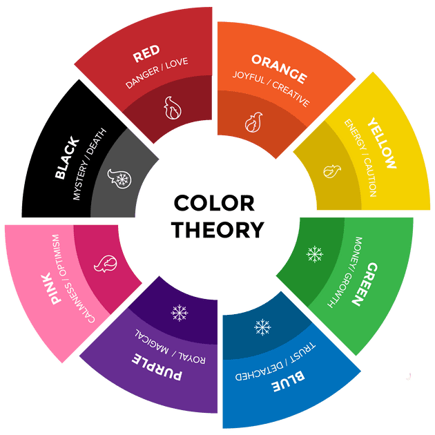
Color Theory
Color theory is a body of practical guidance to color mixing and the visual effects of a specific color combination. It is the science and art of using color. There are three basic categories of the color theory: the color wheel, color harmony, and the context of how colors are used. Understanding how to use different colors to convey meaning is an important part of both design and marketing. Colors are organized into three categories: primary color, secondary colors and tertiary colors.
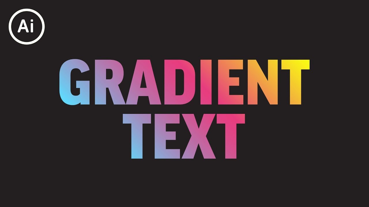
Gradient
Gradient is the gradual change of colors (such as green turning gradually into blue) or a color fading into transparency. There are two common types of gradients: radial and linear. A linear gradient is defined by an axis - the gradient line - and two or more color-stop points. Radial gradient is perceived when the colors fan out from the starting point in a circular pattern.
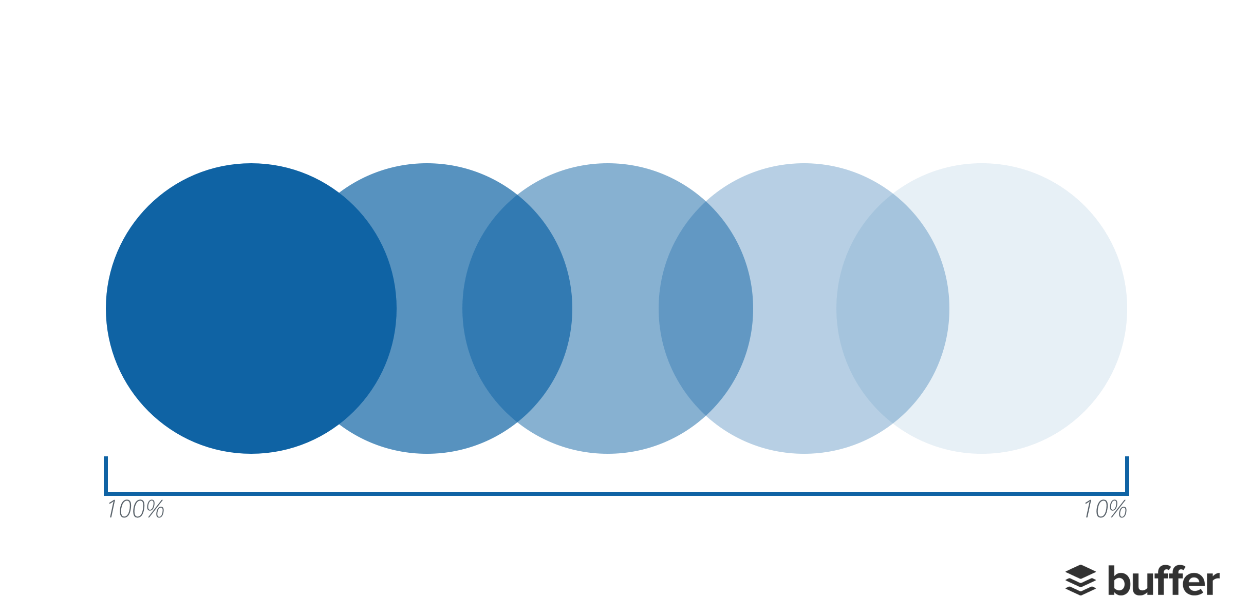
Opacity
Opacity enables us to make an element of a design transparent. The lower the opacity, the more transparent an element is. For example, 100% opacity means an object is solid, and 10% opacity means and object is almost fully transparent.
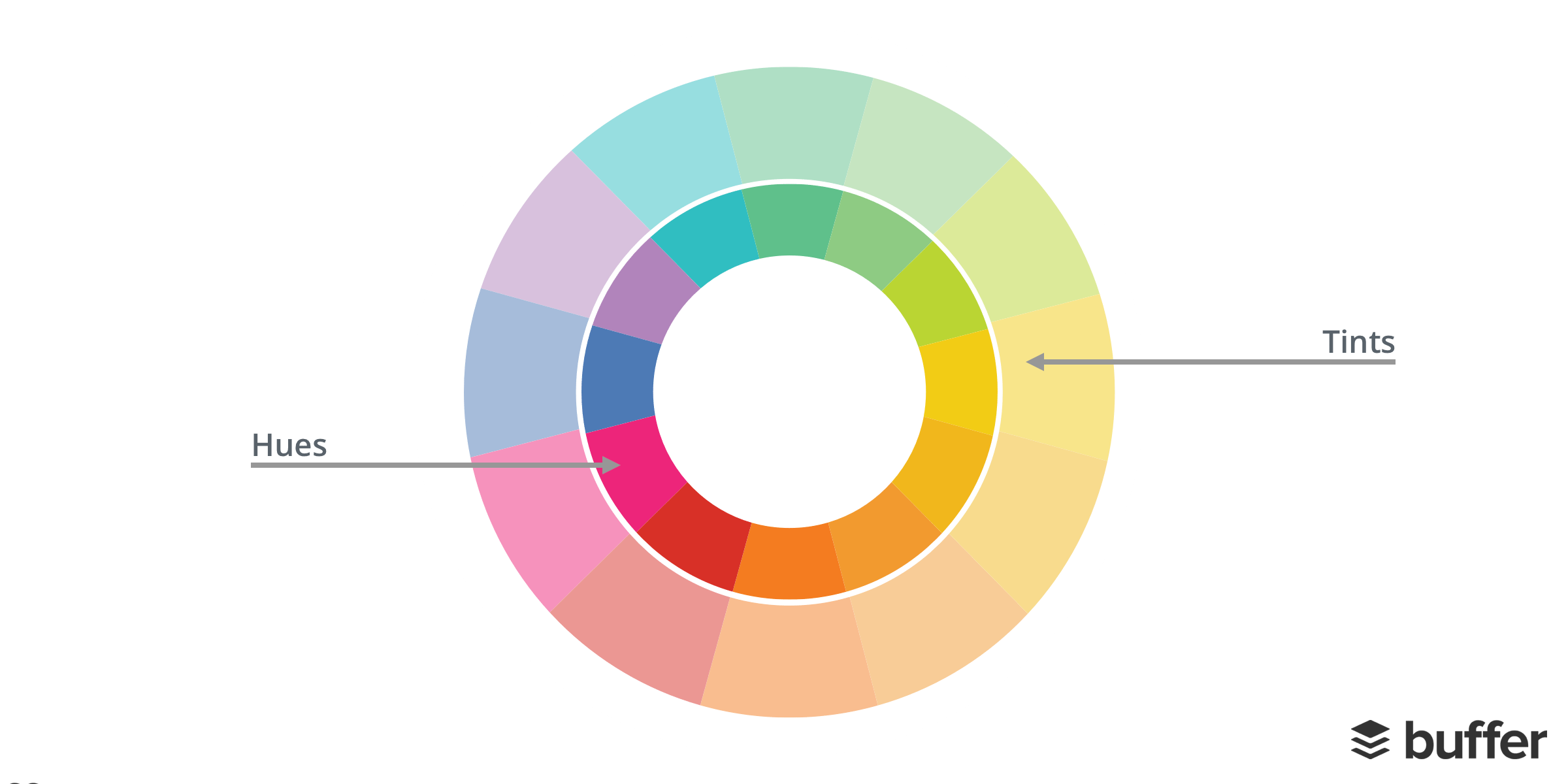
Hue & Tint
Hue is a way to describe a color. It can be any color on the color wheel. For example, red, blue and yellow are all hues. A tint is a variety of a color. Tints can be created when adding white to any hue on the color wheel. This lightens and desaturates the hue, making it less intense.
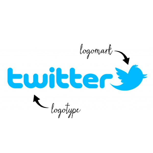
Logotype & Logomark
Logotype is the name of the company that is designed in a visually unique way for use. Most of the time when people refer to a logo, they're referring to the brand's logotype. Logomark generally does not contain the name of the company and instead more abstractly represents that company using a symbol or a mark.
Icons
Icons are images that are used to represent an action or an object. When using icons, think carefully about what you want to signify and how clear it is to your audience.
![]()
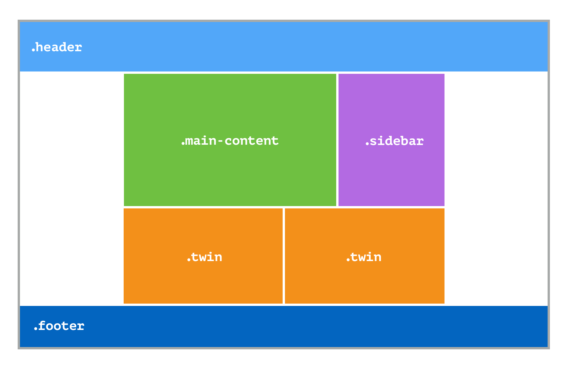
Grid
A grid is a pattern of horizontal and vertical lines spaced out at regular intervals, forming squares and rectangles. A grid is there to help designers arrange elements in a consistent way.
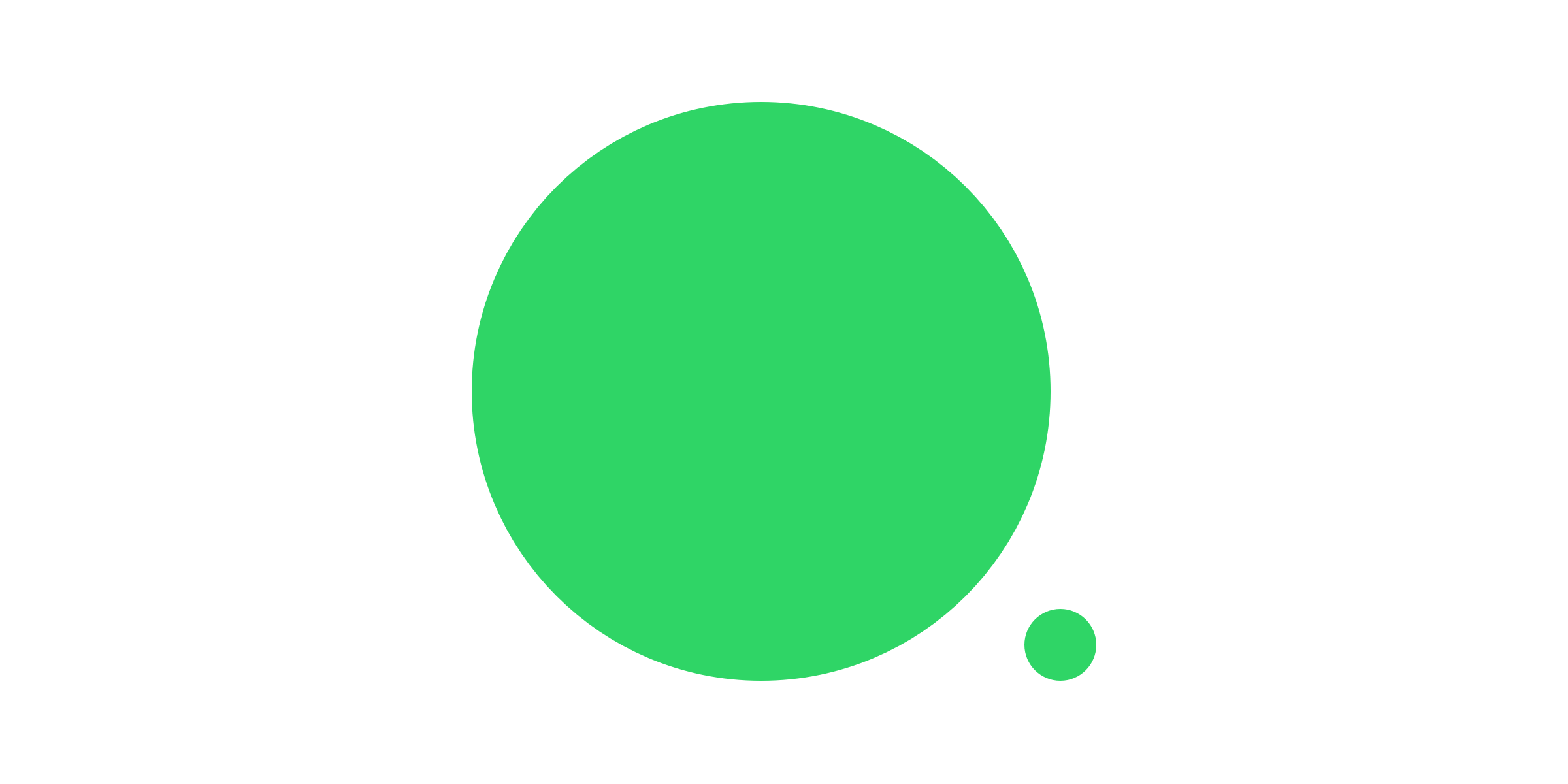
Scale
Scale is the size of an object in relationship to another object. Two elements of the same size can be seen as being equal. Whereas elements with a clear variation in size tend to be seen as different. When putting together a design, think about how you can utilize scale to help you illustrate the meaning behind your image.
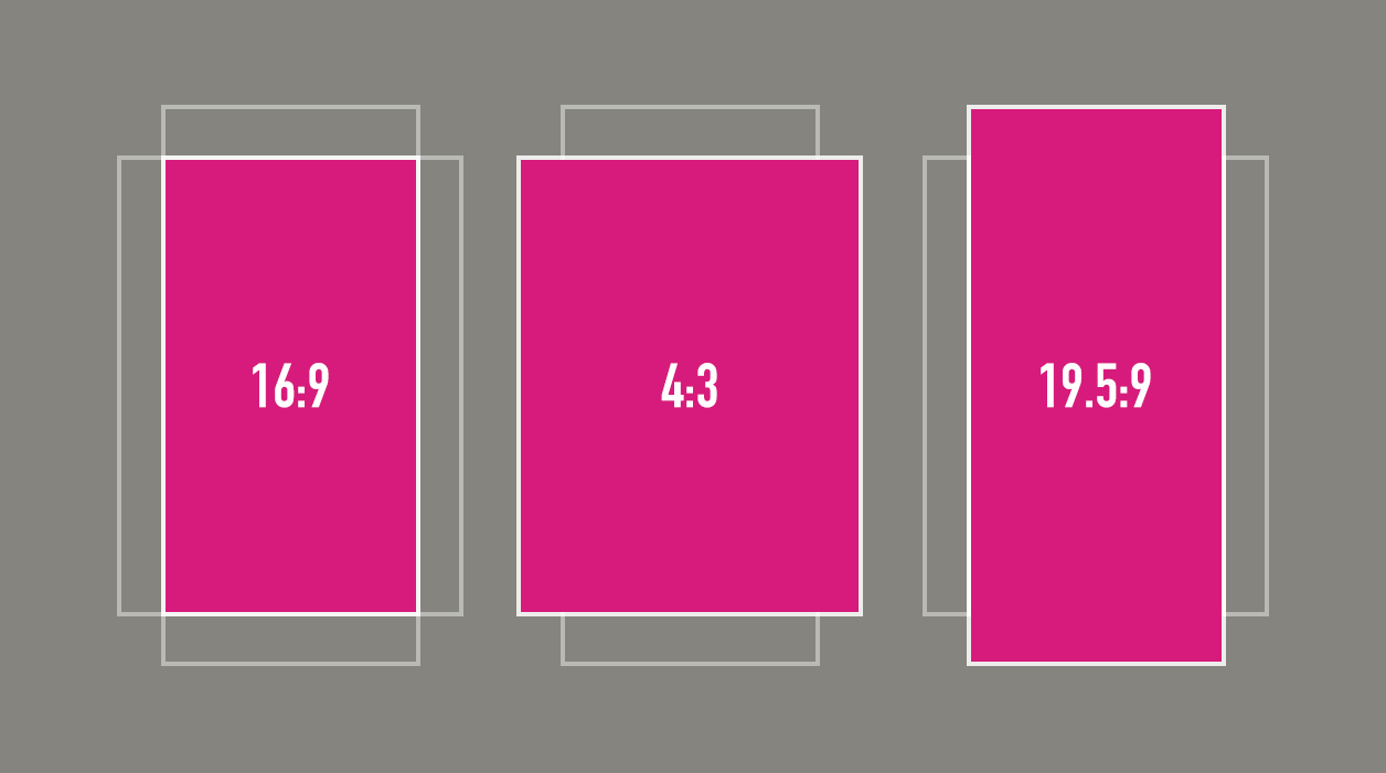
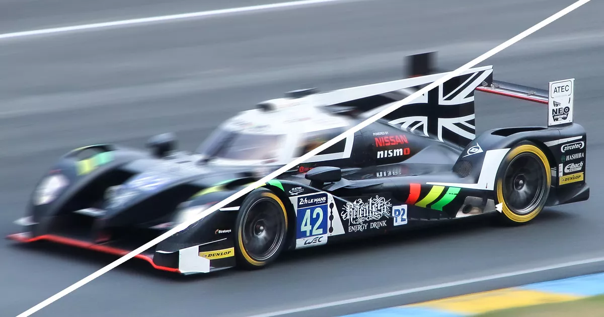
Aspect Ratio
Aspect ratio is the proportional relationship between the width and height of a rectangle (a rectangle is used because the vast majority of screens are wider than they are tall). An aspect ratio is defined via a mathematical ratio, with two numbers separated by a colon, width:height. For example, 4 inches wide by 3 inches tall would be a ratio of 4:3.
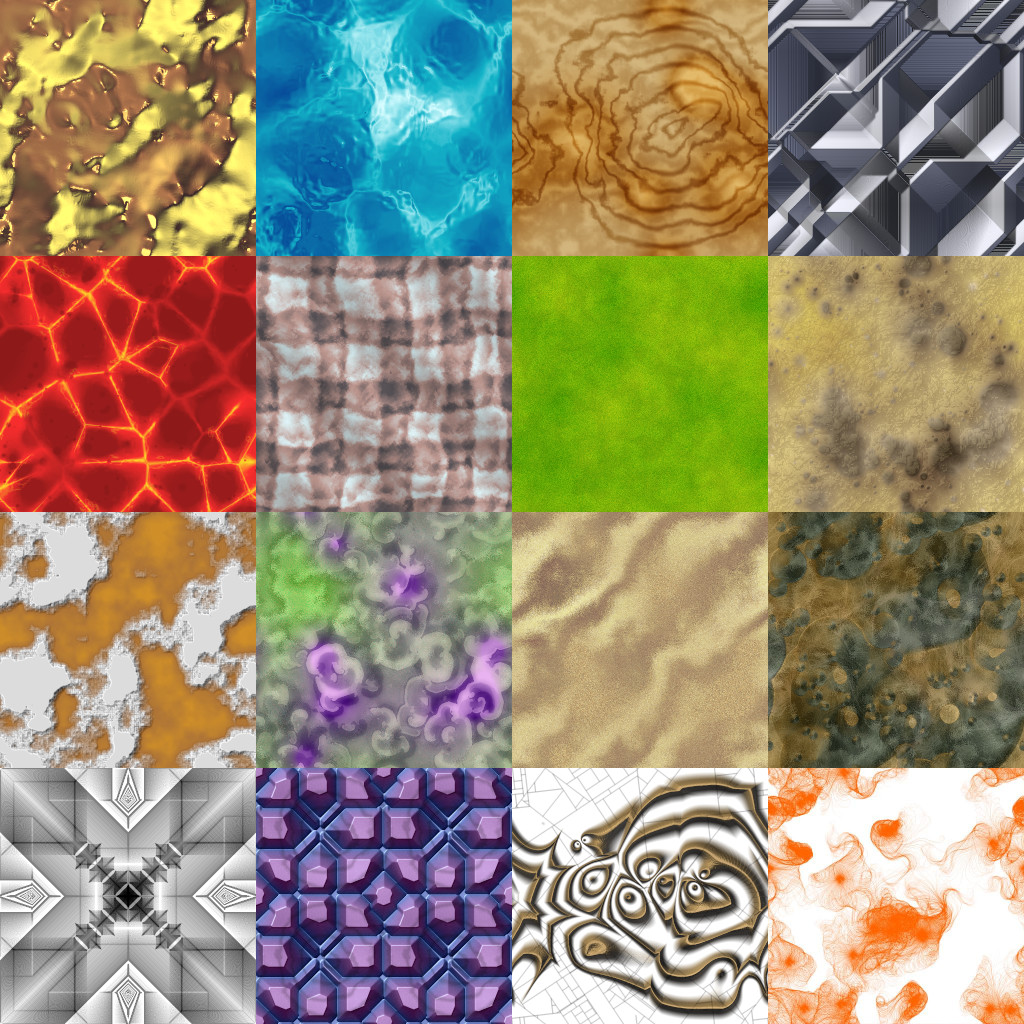
Texture
A texture can be described as the surface characteristics of an image. In design, you can utilize textures such as a cloth and a brickwork to mirror the visual appearance of the actual texture.
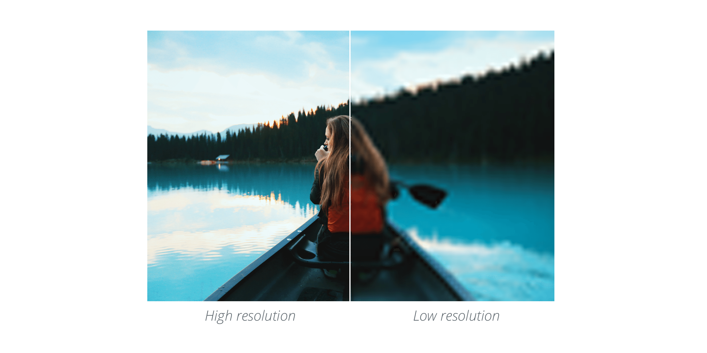
Resolution
The resolution of an image determines the quality. The higher the resolution is on that particular image, the higher its quality. A high-resolution image will be clear and crisp whereas, a low resolution image will feel a little pixelated and blurry.
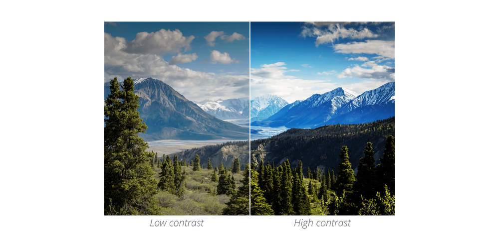
Contrast
Contrast is the difference in luminance or colour that makes an object distinguishable. Contrast occurs when two elements on a page are different. For example, it could be different colors between the text and the background color or dark vs. light colors.
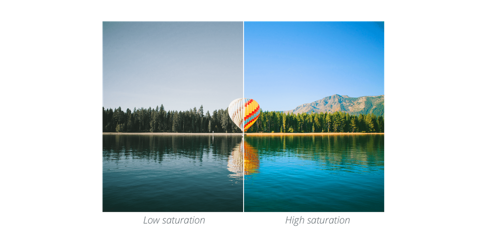
Saturation
Saturation is the state or process that occurs when no more of something can be absorbed, combined with, or added. Saturation refers to the intensity or purity of a color. The more saturated a color is, the more vivid or brighter it appears. Whereas, desaturated colors, appear a little duller.
Blur
Blur makes images more unclear or less distinct. Using a blur can be a great way to make text stand out when overlaid onto an image.
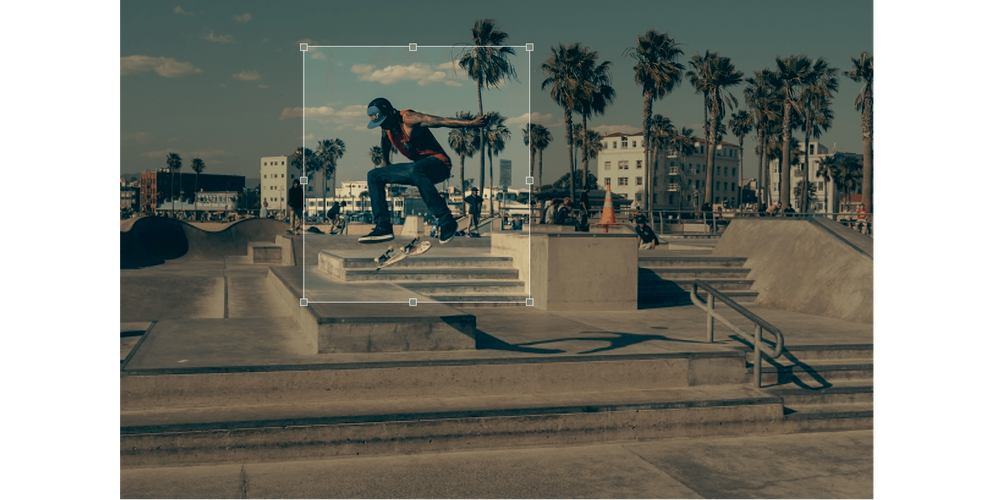
Crop
Crop is the removal of unwanted outer areas from a photographic or illustrated image. Cropping allows you to change the emphasis or direction of an image.
Flat
Flat design is a minimalistic approach that focuses on simplicity and usability. It tends to feature plenty of open space, crisp edges, bright colors and two-dimensional illustrations.

Skeumorphism
Skeumorphism is when a digital element is designed to look like a replica of the physical work.
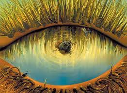
Surrealism
Surrealism is a 20th-century avant-garde movement in art and literature which sought to release the creative potential in revolutionizing the human experience. It balances a rational vision of life with one that asserts the power of the unconscious and dreams.
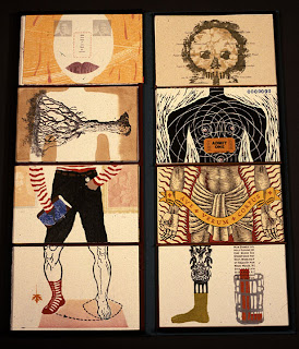
Exquisite Corpse
Exquisite corpse, or exquisite cadaver in French, is a method or technique that resembles a collection of words or images, which was first used by surrealist artists to create bizarre and intuitive drawings.
Vector
Vector are images that are made up of points, lines, and curves. All of the shapes within a vector are calculated using a mathematical equation which means the image can scale in size without losing any quality.
And that's a wrap!
I hope that this guide was useful and provided a ton of information for anyone interested or currently working in the field of design and development. Let me know if I need to add or modify anything to this guide by reaching out to me on Twitter and I'll be happy to address the issue.